We’ve been working A LOT on the sequel to this hell-spawn game ROTE, adding new features, new levels, new ideas and everything that went through our minds and that were feasible.
We know that many of you liked the clean style of the whole game, but if the game ends up too clean it would look boring and repetitive – especially on big screens.
Since our goal is to publish the sequel on almost any platform we can afford releasing on, we decided it would be a pretty awesome idea to add few objects in the game… and by few I mean lots of objects! But unfortunately, this lead to some problems.
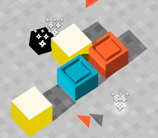
It all started with colors:
Maybe not those colors, but hey it’s just an illustration !
Colors were pretty simple in the previous game, they were as simple as just going to a palette website, drinking few bottles of jack and choosing one that my drunk-mind would find acceptable.
Then it was simply split in 3 categories:
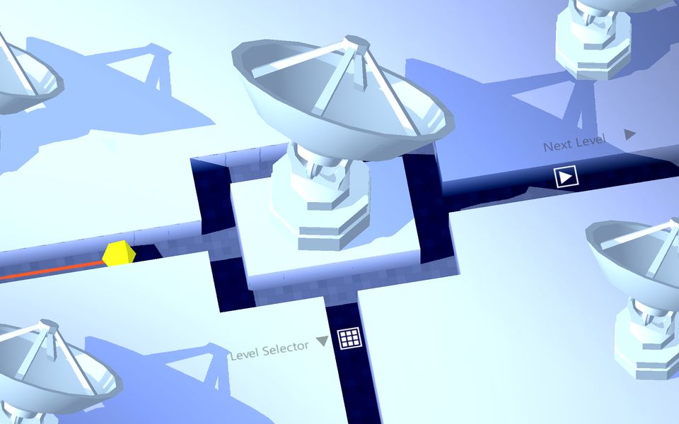
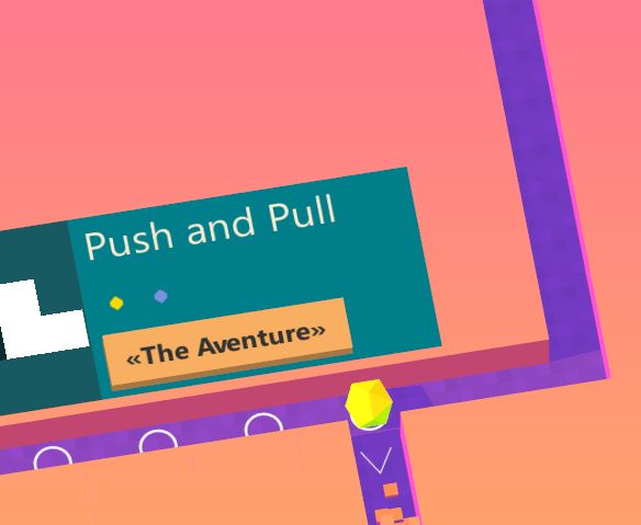
Yellow = Everything that’s intractable
Orange & Blue = Indicators and blocks
Light Blue = Non-eye-staining background ( always better than full white )
Can’t get any simpler than that!
Choosing one bright color for everything that can be interacted by user was a great drunk choice, and sober me was happy the next morning.
The whole theme is perfect for playing the game on small devices such as smartphones and tablets, but unfortunately those colors will burn your eyes out if you try playing for too long on a bigger screen. After making that previous game and testing it for months I can still see those colors engraved into my eyesight every time I blink.
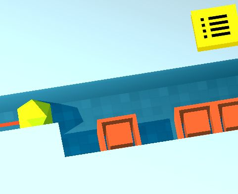
So Seb and I went through a long process of what I call the most pointless yet most important part of gamedev, the coloring week!
Admire my search engine skills
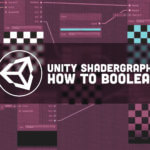
After a while, we thought maybe making custom shaders would benefit us to have a new fresh style.
So I spent a nice week of making shaders, because if there’s one thing fun in 3d, it’s shaders.
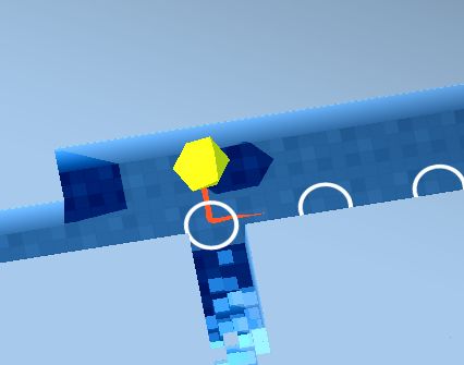

Aren’t those beautiful? I like the 4th one, but Seb almost had a stroke so I had to change.
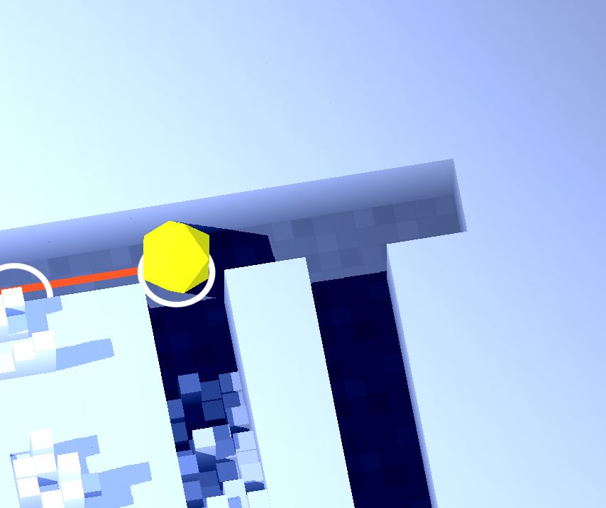
Anyhow, all of those were various iterations of the main theme we wanted to have.
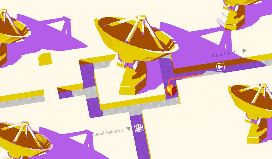
None of them were chosen. Mostly because they look good in simple environments, but once we start adding new “decorations” it starts looking odd ( unless you keep every model the same color). Also because I had to calibrate model shaders to fit the style of everything else, which I have to say is one hell of an annoying job.
You can see on the how models seem a bit out of place in the corners, it looks worse with colored models but those old screenshots were burned in a fire.
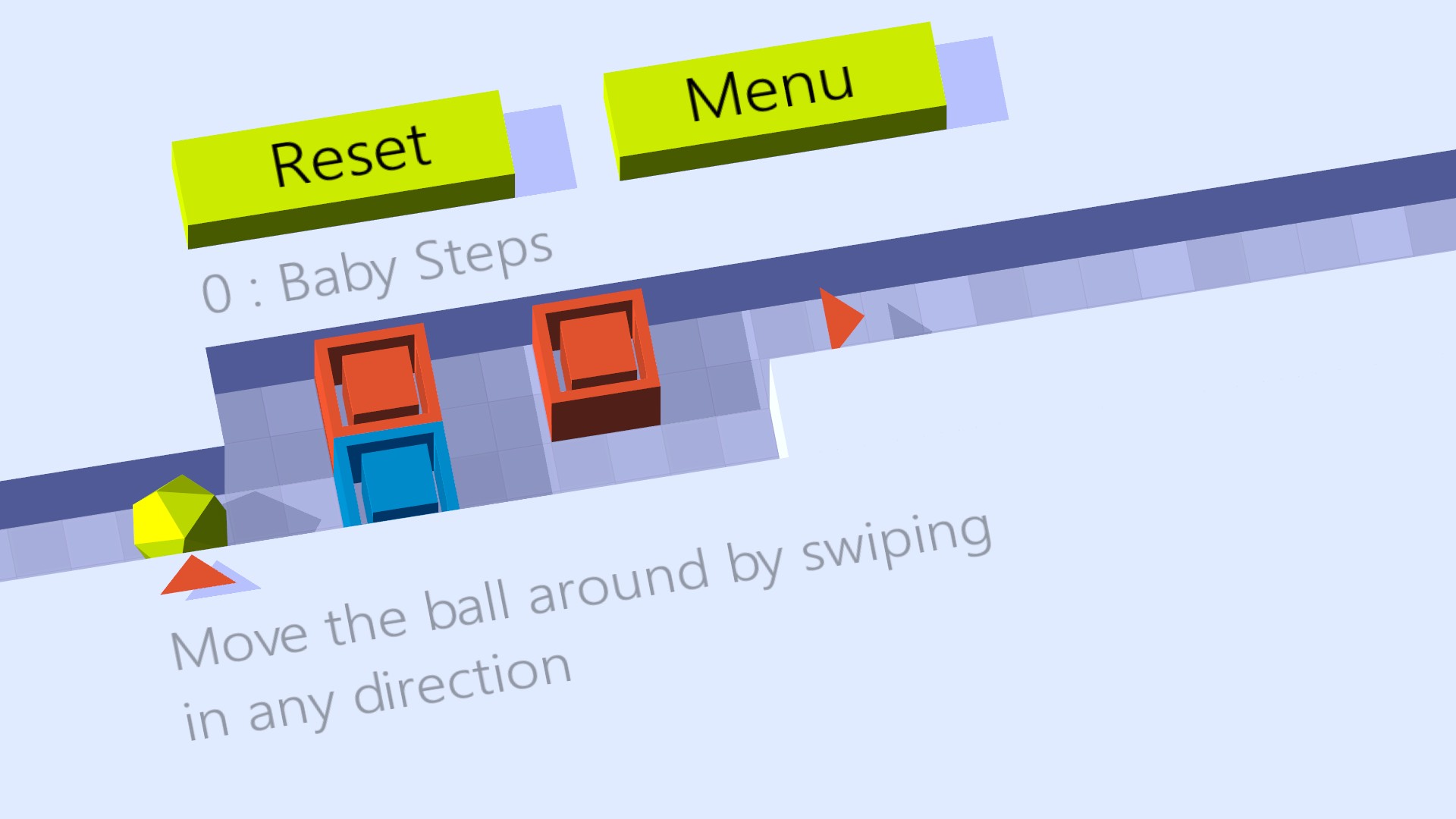
So in the end, instead of categorizing few limited colors into different functions of the game, we just backpedaled and decided to make so that the game’s colors adjust as you play.
This way we’re no longer bound by a limited set of colors, and for each scene we can adapt the lighting and colors so that the models in that scene don’t look too much off.


And I have to say it looks sexy as ever. I’d love to show more screenshots, but I can’t… yet.
One last thing I’d like to say is that the name for ROTE 2 ( or Rote Revolution as you’ve seen in the previous thread ) is gonna change to “AfterLoop“, we’ll explain you the reason why next week!